Duration: 6–8 Weeks Objective: Build responsive websites that look good on desktop and mobile devices. Prerequisites: Basic knowledge of HTML, CSS, JavaScript
Introduction to Responsive Web Design
What is responsiveness?
Viewport & media queries
Mobile-first design approach
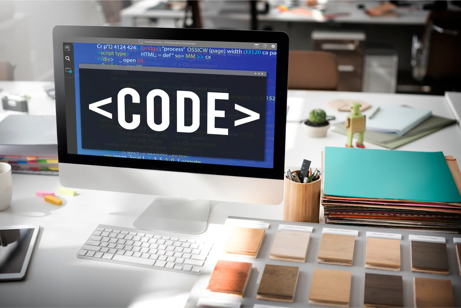
HTML5 Essentials
Semantic tags (header, footer, article, section)
Embedding media: audio, video
Forms and input types
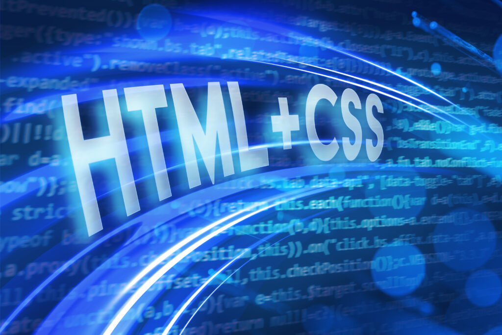
CSS3 Essentials
Selectors, colors, gradients
Flexbox & Grid layout
Transitions, animations
Responsive Techniques
Media queries for different devices
Fluid grids & flexible images
Using frameworks (Bootstrap / Tailwind basics)
Building a Complete Project
Responsive landing page
Testing on multiple devices
Outcome of the Course:
Students will able to design website.
Students can write their own code
They can experience the coding life.
Experimenting will boost confidence
Better opportunity of getting jobs.
At SH Computer Academy, we offer a comprehensive series of courses designed for students in Pakistan after Matric and Intermediate, with the aim of equipping them with practical web design and development skills. The first program is Responsive Web Design with HTML5 and CSS3, a six to eight week course that introduces students to the concepts of building mobile-friendly and desktop-ready websites. The course begins with the fundamentals of responsive layouts, before moving on to HTML5 semantic elements, multimedia integration, and form handling. Students then progress to CSS3, where they learn about selectors, gradients, transitions, animations, and modern layout techniques such as Flexbox and Grid. With the integration of media queries and mobile-first design principles, learners construct fully responsive web projects that adapt seamlessly across devices. By the end of the training, students will be able to design professional websites that look attractive on desktops, tablets, and smartphones.
Course Details
Class Time
1 Hour Class
Course Duration
6 - 8 Weeks
skill level
Advance
language
English
boys lab
Ali Raza Computer Lab
Certifications
Yes
Classes ongoing
Yes
Course Price
25000/month
Seperate Classes
for Females
girls lab
Khadjia Alia Computer Lab
We are the pioneers in guiding student on the road of success
are you ready to start you courses
SH Computer Academy brings a golden opportunity for the students of Daulat Nagar, Gujrat and nearby to learn the skillset which will help them to grow in their lives.
SH Computer Academy, located in Daulat Nagar near Gujrat, empowers students in Pakistan with practical tech skills through industry-focused courses in web design, IT, and digital creativity. We are Approachable.